Showing posts with label collage. Show all posts

Sunday, November 2, 2014

Books Unbound II

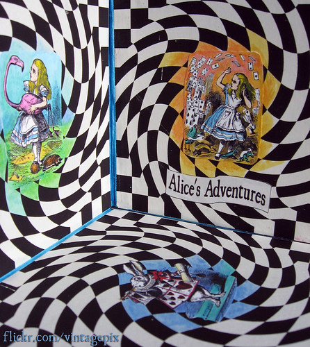
Alice's Adventures (detail)
I just dropped off my pieces today for the show "Books Unbound II" by members of the Binders Guild book arts group here in Milwaukee. The show will be up November 9-30, 2014 at the Marian Gallery in Caroline Hall at Mount Mary University, Milwaukee, Wisconsin. There will be an opening reception on Friday, November 14, 2014 from 6-8 p.m. (See also my previous blog post.) There will be quite a variety of handmade books and other book-related art. We each had to do a 12x12" canvas around the theme of story-telling so I used a quote from Jane Austen's Pride and Prejudice for my collage.
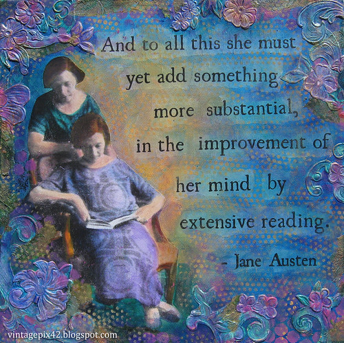
  Extensive Reading
We also each did an abecedarium or alphabet book. Mine is an accordion book "A to Z Tangles" with 2" square pages, each featuring a different handdrawn tangle pattern. The back of each page has the designer's name listed for each pattern. I had a lot of fun drawing these, but some letters it was difficult to choose just one pattern!
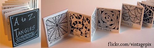
A to Z Tangles accordion book
 We also each did a piece inspired by the theme "Cabinet of Curiosities." For mine I added to an assemblage piece "Inexplicable Syncopation" that I had done in 2007 for a show at the Bay View Book Arts Gallery, because I had never felt that the piece was quite completed (and I still don't but I had a deadline).
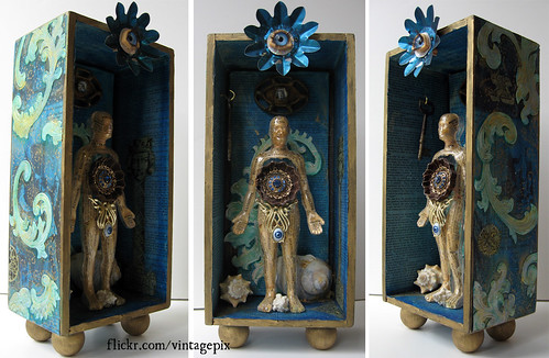
Inexplicable Syncopation
You can see these and my other books on Flickr here.

Saturday, October 11, 2014

Work in Progress for Upcoming Shows

As it has been some months since my last post, here's an update on a few things I've been working on.  You can also "Like" my Facebook page, as I am somewhat better about posting little updates and photos there. (Somewhat!)

 I'm submitting work for two shows this fall and also participating in the Crafters Marketplace again.
Opening first is "Books Unbound II," the second show by the Binders Guild book arts group. (The first show was in 2010, and you can see photos here.) This year's show will be up November 9-30, 2014 at the Marian Gallery on the Mount Mary University campus in Milwaukee, Wisconsin.  The book on the far left in the announcement above is one of my books, and I will try to post more photos in a future blog postUPDATED:  Also see my Books Unbound II Flickr set here

Each participant is also doing a 12 x 12 inch canvas for the show, and this is mine:

I'm also planning to participate in the annual Warped Milwaukee fiber arts show again this year and am working on my submission this month (as the application is due October 31!), and you can see a sneak peek here:

The fiber arts exhibit will be up from November 14-30, 2014 in the Jazz Gallery, 926 E Center ST, Milwaukee, and on the last two days of the show November 29-30, 2014 (the weekend after Thanksgiving), I will also be in the Crafters Marketplace there as well. If you're interested in participating in the Warped Milwaukee show or the Crafters Marketplace, here is the overview. (You may have to click on the image to enlarge it to a more readable size.)
You can also find the info and the links for the separate applications for both the fiber art exhibit and Crafters Marketplace on the ABK Weaving Center blog and the Warped Milwaukee Facebook page or Google+ page.

So even though I have not been blogging, I have been busy!

Sunday, April 7, 2013

Very Tiny Art

Tiny Ladies - top view
This winter my friend Mel Kolstad invited me to participate in an exhibit she was organizing to benefit the Foundation Fighting Blindness, entitled "Through Mia's Eyes." In 2011, Mel's niece Mia was diagnosed with Stargardt's disease, a hereditary condition that left her legally blind in a very short time. She is still able to see color, shapes and light, and Mel asked artist friends to make quarter-inch square art, the tiny size giving viewers a sense of the difficulty Mia now has in seeing her world. Just working on the tiny squares was a challenge, and when Mel first handed me the 1/4" chips, I asked, "What the heck am I supposed to do with these?!"  (When we were looking at these at the March Milwaukee ATC meeting, someone dubbed them "quinchies" for quarter-inchies.)

I finally decided on collage using the smallest faces I could find, portraits cut from postage stamps. I used my thinnest paint brush to add some lines and color, and I cut fine print text from a vintage book to glue around the edge. The hardest part was not being able to see clearly what I was doing, not to mention dropping my tiny pieces or having them stick to my fingers while I was working. (I ended up manipulating everything with with the tip of an X-acto blade, because my fingers were just too big and clumsy!)

The portraits and text from left to right:
Lucy Stone - "don't keep quiet"
Queen Elizabeth II - "not an old lady"
Grace Kelly - "look in her eyes"
Tiny Ladies - Side View
The show "Through Mia's Eyes" will run April 16-June 1, 2013 at the Gallery & Frame Shop in Fond du Lac, Wisconsin.
Here's an article about the show in the Fond du Lac Reporter.
And the Pinterest board featuring some of the art that will be in the show.

Saturday, March 2, 2013

Museum of Wisconsin Art's New Building

IMG_5522 Museum of Wisconsin Art 
My husband and I drove up to West Bend today to drop off my artwork at the Museum of Wisconsin Art, which has a brand new building opening in April 2013. The curator had told me when giving directions that it looked like the prow of a ship and "you can't miss it," and she was right. The building is wedge-shaped, wide on one end and very skinny and pointy on the other.
IMG_5525 Museum of Wisconsin Art IMG_5526 Museum of Wisconsin Art
(That's my husband testing out the sharp edge.) IMG_5528 Museum of Wisconsin Art
We didn't get to see much of the interior beyond where we dropped off my art with the registrar, but it looks a lot brighter and spacious than the old building.  We'll be back for the opening weekend, April 6, 2013.  My collage "Once Upon A Time" will be in the Wisconsin Regional Artists Association exhibit there from April 6-June 23, 2013
Once Upon A Time

Saturday, July 7, 2012

More Art Marathon fiber art

This past week I've been doing some fiber art for the Cream City Illustrators Art Marathon, including some fabric collage ATCs:
 17 - Summer Flower Collage #1 18 -Summer Flower Collage #4
I finished a crochet poppy pattern from the book Crochet Bouquet and did my variation on a jellyfish pattern from Amigurumi Toy Box
20 - Crochet Poppy 21 - Crochet Jellyfish
When I started the amigurumi jellyfish, it looked like a little Rastafarian hat so it is now known as the Rastafarian jelly fish....

I also finished these wee quilted houses, which may eventually end up in my Etsy shop.
 22 - Three Wee Fabric Houses
You can see all my marathon art in my Flickr set here.

Friday, June 29, 2012

Art Marathon!

I'm participating in the Cream City Illustrators Art Marathon, which challenges you to make 26.2 works of art in 30 days from June 14-July 14, 2012. I've primarily been doing ATCs (of course), and here are some of my favorite ones so far.
Day #4 - Jellyfish (fabric collage)
 04 -Jellyfish 
Day #5 - Bird of Paradise
 05 - Bird Of Paradise 
 Day #8 - Amigurumi Bear
 08 - Amigurumi Bear 
Day #11 - Alone
 11 - Alone 
You can see the full set to date on Flickr. Also check out what other participants have posted on the Cream City Illustrators blog.

Sunday, February 5, 2012

Anti-Valentines

Anti-Valentine Heart #2The first Ten Two Studios Design Team challenge for 2012 was to make Anti-Valentines in response to Valentine projects we had done in the past. I collaged some black-ribboned chipboard hearts and "Bloody Valentine" Artist Trading Cards, using images and text from the Ten Two Studios' Anti-Valentine and Black & White collections plus some vintage poison pharmacy labels.

Anti-Valentine Heart #3
Check out the front page of Ten Two Studios now through Valentine's Day to see the daily Valentine & Anti-Valentine eye candy from the design team!
Bloody Valentine ATCs #1-3
Bloody Valentine ATCs #4-6

Tuesday, November 8, 2011

September & October workshops & artsy stuff

Life has been busy this fall so it's time to catch up on the bloggin'! Since my last post in mid-September, I took two workshops organized for the Milwaukee Artist Trading Card group by group member Gary). MKE ATC member Lynne taught an ATC background workshop before our September meeting. We had a lot of fun making colorful serendipity collage backgrounds, and as a result I got a lot of ATCs made for our future trades!
Tinted Twenties Cutie #1Tinted Twenties Cutie #2
These use images from the Ten Two Studios "Tinted Twenties Cuties" image CD. You can see pix from the workshop and complete set of ATCs in my Flickr photostream

In October we met at RedLine Milwaukee, a wonderful non-profit community art studio that includes a print shop and paper making space. Artist Dara Larson showed us how to make ATC-sized papers and carve printing blocks to decorate them. Here's Mel pulling her first set of handmade paper ATCs:
IMG_3815
And my paper "wet off the press"!
IMG_3823 My handmade paper ATCs
(I still haven't decided what I'm going to do with them.)
Since Halloween was fast approaching I made a Day of the Dead stamp design, of course, inspired by the figure they had on display in the print shop.
IMG_3829 My skull stampIMG_3834
More photos are here. If you live in the Milwaukee area be sure to check out RedLine's upcoming workshops.

Saturday, March 5, 2011

Art Journal: deMengian Mumbo Jumbo

Mumbo Jumbo
This past week, I've been working on a journal spread inspired by Michael deMeng but since the March Sketchbook Challenge theme is Spilling Over, I perhaps used some of his techniques to excess!

I was fortunate to take two workshops from Michael at the Raevn's Nest Art Retreat in 2008, and I learned a lot from his techniques creating the effect of age and patina using acrylic paints. All these images started out as black & white photocopies of Dover vintage clip art (and one 19th century portrait from my personal collection) and were colored with paint. My friend Gary used Michael's "ghostly glow" technique on his ATCs last month, so I had a go at that with mixed results. The interpretation of this collage is up to you!

March 1-5, 2011

Saturday, February 19, 2011

Art Journal: Opposites Distract

Inspired the Sketchbook Challenge theme for February "Opposites" - I decided to do a spread where I went in the opposite direction of what I usually do. So I used colors I don't particularly like to work with like bright red, yellow and green. I'm more of a purple & blue gal!  I pulled out some handcarved stamps that I had made in a workshop but didn't like how they turned out because they were so "blocky" (Yes, I know that's how handcarved tends to look.)
Carved Stamps Workshop
As my blog title implies, I like to work with vintage images, so the opposite direction, painful though it would be, demanded a contemporary photo, and since I hate using pictures of myself...bleh - there I am. And printing it on yellow paper made it even worse! Oddly enough, the hardest part was picking a font that I would not normally use. I had narrowed it down to Mistral (horribly '80s and hard to read) or Stencil, and opted for Stencil just to be legible. And instead of writing the dates of this endeavor in small print in the margins, I then stenciled them in the center of the spread. And for a finishing touch, I scribbled all over with a greenish SpiderWriter pen. Here is the end result:
Opposites Distract

Saturday, February 12, 2011

Art Journal: Suvetar, Goddess of Spring

Inspired by Pam Carriker's workshop at Strathmore, I originally did this journal spread in January but was unhappy with the result and knew I would redo it.
Is it Spring yet?
So in February, I wiped away the oil pencil handwriting and gessoed over the messy areas and redid the text with a curly font and added more flowers and paint.
Suvetar, Goddess of Spring (open)
The images are all from the Ten Two Studios. The right side is a folding flap. Here's the spread with the flap closed.
Suvetar (folded)
The spread was inspired by the song Suvetar, Goddess of Spring by Gjallarhorn. (The liner notes say it's their arrangement of traditional verse.)

Is it spring yet?

Tuesday, February 8, 2011

Art Journal: Opposites

The February theme for the Sketchbook Challenge is Opposites, and this journal spread started with two halves of the same face glued on opposite sides of the page, with a vague idea of doing something like "Good & Evil" or "Night & Day" or an evil twin.
IMG_2100 Opposites
If you watch a lot of BritLit TV, you may recognize Gillian Anderson as Lady Dedlock in the 2005 version of Bleak House. Inspired by Pam Carriker's Recycled Journal Pages workshop on the Strathmore website, the background is torn rice paper left over from my book arts' group's 2008 gelatin printing play date. Then I went over the whole thing with a thin layer of gesso, oil pastels & oil color pencils, Permapaque marker, and acrylic paint stenciled through punchinella or sequin waste.
Two Sides of the Same Coin
Finally, I decided that declaring things to be opposite created false dichotomies, as these two women were actually the same person, so my spread about opposites ended up with the text "Two sides of the same coin."

Art Journal for Feb. 3, 4 & 7, 2011

Wednesday, February 2, 2011

Art Journal: Tudor Girls

This past weekend, I finally took photos to show work-in-progress on a journal spread (and you'll see that my progress each day is pretty minimal). I started out on January 28 realizing that it was nearly time for bed and I needed to do something in my art journal. (This happens a lot.) I had a large image of Queen Elizabeth I from an old magazine that I couldn't bring myself to throw it out. So I slapped on a background wash in acrylic and glued her Majesty in place. I wasn't sure what I was going to do with it, but I've been watching the first season of The Tudors, now that it's airing on BBC America. So the next day, I found portraits of the six wives of Henry VIII and printed them out on my black & white laser printer. (Poor Kathryn Howard's portrait may not even be her.) I added a bit of gesso around them to soften the edges a bit.
Tudor Girls - in progress
Despite having studied British history, taken a class in Tudor history in college and seen numerous costume dramas, the only way I keep track them is by the mnemonic "Divorced, Beheaded, Dead, Divorced, Beheaded, Lived." After I added color with Letraset & Permapaque markers and a bit of acrylic paint, I wrote these words down to remind me who's who.
Tudor Girls - in progress
The next day, I added their names and the page title. (Sorry, I couldn't think of anything suitably punny.) Thanks to the Strathmore Visual Journal workshop, I had rediscovered my oil pastels, so I used those to add more color, framing each portrait in red.
Tudor Girls - in progress
On what may or may not be the last day, I stamped and embossed some designs in gold to give it a bit of royal flair.
Tudor Girls - Complete?
Is it done? Well, for now it is! And I'd better figure out what the heck I'm doing in my journal TODAY!

UPDATE: This spread has a folding flap so I finally did something with that, adding Henry VIII to the side:
I'm Henry VIII, I am
Related Posts Plugin for WordPress, Blogger...