
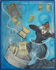
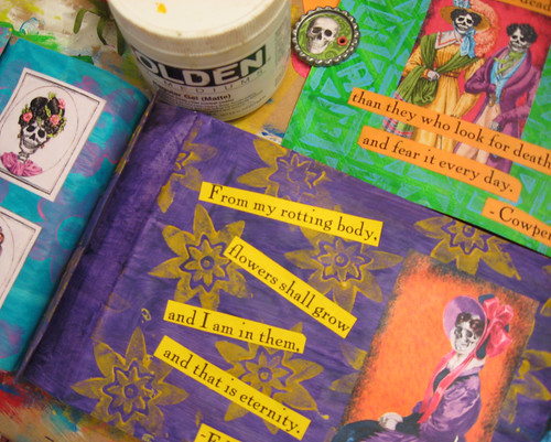
 I've been so busy with non-artsy work lately that it's all I can do to write a blog post once a week! But I have been trying to get a little bit of art done every day. Right now I'm working on another Ten Two Studios design team challenge. This time I have a waterfall paper bag book and some of the new eye-wateringly colorful Day of the Dead sheets.
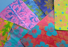
 I LOVE 'EM! The bright color combinations inspired my backgrounds. I gessoed the paper bags pages & inserts so the lighter acrylic paints would show up more vividly and then added designs in contrasting colors with foam stamps. I don't think I've ever used orange, turquoise and lime green together before this! So far I've got the main imagery and the text laid down. Now it will probably sit for awhile until I decide what to do next!


8 comments:
I love the riot of colour. Not garish at all. And totally appropriate to Day of the Dead. Fabulous!
Thanks, Deborah! I've decided if people don't have to squint and put sunglasses on to view it, I haven't done my job :D
i love the color combinations!
I'm smiling through my squinting! LOL I lOVE the vibrancy! You've done a magnificent job of it, Carolyn! Hugs, Terri
Gorgeous, Carolyn...awesome colors.
Thanks, Amy, Terri & Gayle, for stopping by to risk your eye sight ;o)
You use the color so well that it's not garish in the slightest! I love your color combos, Carolyn!
Thanks, Mel - maybe I'm not trying hard enough ;o) A little bit more lime green perhaps?
Post a Comment