Friday, February 25, 2011

Art Journal: Zentangle A Day

The past two weeks have been very busy so I started a Zentangle journal spread where I could just add a little bit of ink every day and then color the black and white designs with Letraset markers & colored pencils. Does a Zentangle a day keep the doctor away?
A Zentangle A Day
Journal spread completed February 16-20 & 24-25, 2011

If you're looking for tangle inspiration, check out these links:
The official Zentangle blog
Molossus's blog - Life Imitates Doodles
Sandy Bartholomew's blog - BEEZ in the Belfry
Zentangle Flickr group

Saturday, February 19, 2011

Art Journal: Opposites Distract

Inspired the Sketchbook Challenge theme for February "Opposites" - I decided to do a spread where I went in the opposite direction of what I usually do. So I used colors I don't particularly like to work with like bright red, yellow and green. I'm more of a purple & blue gal!  I pulled out some handcarved stamps that I had made in a workshop but didn't like how they turned out because they were so "blocky" (Yes, I know that's how handcarved tends to look.)
Carved Stamps Workshop
As my blog title implies, I like to work with vintage images, so the opposite direction, painful though it would be, demanded a contemporary photo, and since I hate using pictures of myself...bleh - there I am. And printing it on yellow paper made it even worse! Oddly enough, the hardest part was picking a font that I would not normally use. I had narrowed it down to Mistral (horribly '80s and hard to read) or Stencil, and opted for Stencil just to be legible. And instead of writing the dates of this endeavor in small print in the margins, I then stenciled them in the center of the spread. And for a finishing touch, I scribbled all over with a greenish SpiderWriter pen. Here is the end result:
Opposites Distract

Saturday, February 12, 2011

Art Journal: Suvetar, Goddess of Spring

Inspired by Pam Carriker's workshop at Strathmore, I originally did this journal spread in January but was unhappy with the result and knew I would redo it.
Is it Spring yet?
So in February, I wiped away the oil pencil handwriting and gessoed over the messy areas and redid the text with a curly font and added more flowers and paint.
Suvetar, Goddess of Spring (open)
The images are all from the Ten Two Studios. The right side is a folding flap. Here's the spread with the flap closed.
Suvetar (folded)
The spread was inspired by the song Suvetar, Goddess of Spring by Gjallarhorn. (The liner notes say it's their arrangement of traditional verse.)

Is it spring yet?

Tuesday, February 8, 2011

Art Journal: Opposites

The February theme for the Sketchbook Challenge is Opposites, and this journal spread started with two halves of the same face glued on opposite sides of the page, with a vague idea of doing something like "Good & Evil" or "Night & Day" or an evil twin.
IMG_2100 Opposites
If you watch a lot of BritLit TV, you may recognize Gillian Anderson as Lady Dedlock in the 2005 version of Bleak House. Inspired by Pam Carriker's Recycled Journal Pages workshop on the Strathmore website, the background is torn rice paper left over from my book arts' group's 2008 gelatin printing play date. Then I went over the whole thing with a thin layer of gesso, oil pastels & oil color pencils, Permapaque marker, and acrylic paint stenciled through punchinella or sequin waste.
Two Sides of the Same Coin
Finally, I decided that declaring things to be opposite created false dichotomies, as these two women were actually the same person, so my spread about opposites ended up with the text "Two sides of the same coin."

Art Journal for Feb. 3, 4 & 7, 2011

Wednesday, February 2, 2011

Art Journal: Tudor Girls

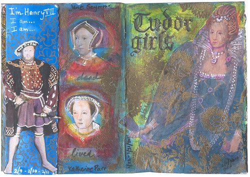
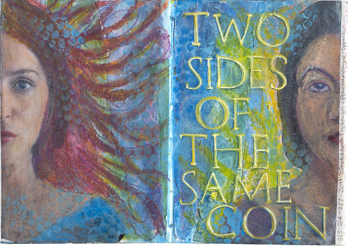
This past weekend, I finally took photos to show work-in-progress on a journal spread (and you'll see that my progress each day is pretty minimal). I started out on January 28 realizing that it was nearly time for bed and I needed to do something in my art journal. (This happens a lot.) I had a large image of Queen Elizabeth I from an old magazine that I couldn't bring myself to throw it out. So I slapped on a background wash in acrylic and glued her Majesty in place. I wasn't sure what I was going to do with it, but I've been watching the first season of The Tudors, now that it's airing on BBC America. So the next day, I found portraits of the 
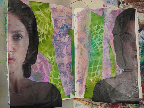
six wives of Henry VIII and printed them out on my black & white laser printer. (Poor Kathryn Howard's portrait may not even be her.) I added a bit of gesso around them to soften the edges a bit.
Tudor Girls - in progress
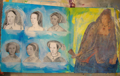
Despite having studied British history, taken a class in Tudor history in college and seen numerous costume dramas, the only way I keep track them is by the mnemonic "Divorced, Beheaded, Dead, Divorced, Beheaded, Lived." After I added color with Letraset & Permapaque markers and a bit of acrylic paint, I wrote these words down to remind me who's who.
Tudor Girls - in progress
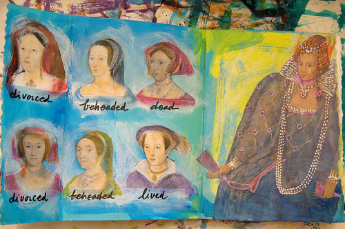
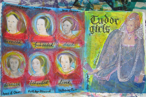
The next day, I added their names and the page title. (Sorry, I couldn't think of anything suitably punny.) Thanks to the Strathmore Visual Journal workshop, I had rediscovered my oil pastels, so I used those to add more color, framing each portrait in red.
Tudor Girls - in progress
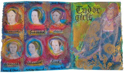
On what may or may not be the last day, I stamped and embossed some designs in gold to give it a bit of royal flair.
Tudor Girls - Complete?
Is it done? Well, for now it is! And I'd better figure out what the heck I'm doing in my journal TODAY!

UPDATE: This spread has a folding flap so I finally did something with that, adding Henry VIII to the side:
I'm Henry VIII, I am

Tuesday, February 1, 2011

Zombie Valentine ATCs

Zombie Valentine #2
I've been making Valentine ATCs for the Milwaukee ATC group's February meeting. The theme is "Word Play" and I'm interpreting it VERY loosely with my Zombie-themed cards! I used images from the Ten Two Studios Zombie collection and text printed out in a lovely font called Zombified designed by Chad Savage.
Zombie Valentine #3
And before you ask, yes, I have read Pride & Prejudice & Zombies, but was disappointed with it. (The prequel, Dawn of the Dreadfuls was actually better, as was Sense & Sensibility & Sea Monsters.) My favorite Zombie movie is still Shaun of the Dead.
Zombie Valentine #9Zombie Valentine #8
Zombie Valentine #4Zombie Valentine #6
You can see the whole set here. Let them eat BRAINS!
Related Posts Plugin for WordPress, Blogger...