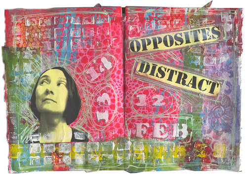
As my blog title implies, I like to work with vintage images, so the opposite direction, painful though it would be, demanded a contemporary photo, and since I hate using pictures of myself...bleh - there I am. And printing it on yellow paper made it even worse! Oddly enough, the hardest part was picking a font that I would not normally use. I had narrowed it down to Mistral (horribly '80s and hard to read) or Stencil, and opted for Stencil just to be legible. And instead of writing the dates of this endeavor in small print in the margins, I then stenciled them in the center of the spread. And for a finishing touch, I scribbled all over with a greenish SpiderWriter pen. Here is the end result: